One thing civil servants learn is to write things down. Here is Academy of Medical Sciences 14 July report commissioned by the UK Chief Scientific Adviser. For the record.
It sets out what was known in July, and clearly sets out what the Government needed to do at the time. Straight off the bat, we have the executive summary.
Line one: “July and August must be a period of intense preparation for our reasonable worst-case scenario for health in the winter that we set out in this report, including a resurgence of COVID-19, which might be greater than that seen in the spring.”
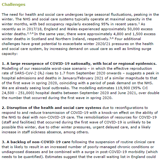
Here are the challenges expected under a reasonable worst case scenario: 1. A large resurgence of COVID-19 nationally, with local or regional epidemics 2. Disruption of the health and social care systems 3. A backlog of non-COVID-19 care 4. A possible influenza epidemic
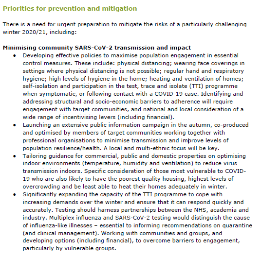
And sets out what we should have done: – public engagement – extensive public information campaign – tailoring guidance – and…
Here we go: “Significantly expanding the capacity of the TTI programme to cope with increasing demands over the winter and ensure that it can respond quickly and accurately.”
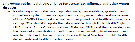
Improving public health surveillance: “Maintaining a comprehensive, population-wide, near-real-time, granular health surveillance system to ensure rapid identification, investigation and management of local COVID-19 outbreaks across community, work, and health and social care”.
But why does this matter? What would happen if we got this wrong? “Even scenarios with Rt in the 1.1-1-5 are likely to stretch the NHS”
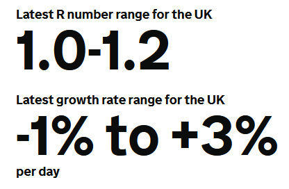
So, what was R? The UK Government estimated it to be 1.0-1.2 (so say 1.1). That was on 11 September. https://gov.uk/guidance/the-r
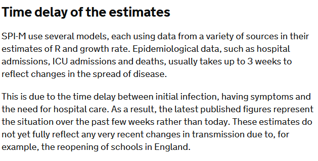
But look at the caveat that goes with that estimate “The latest published figures represent the situation over the past few weeks rather than today. These estimates do not yet fully reflect any very recent changes in transmission due to, for example, the reopening of schools…”
Now re-read the @uksciencechief‘s report “Even scenarios with Rt in the 1.1-1-5 are likely to stretch the NHS”
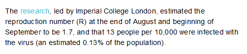
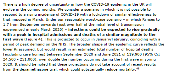
But what is this reasonable worst case scenario? Back to the report. Oh, and there’s talk of R being 1.7 again:
“infections could be expected to rise gradually with a peak in hospital admissions and deaths of a similar magnitude to the first wave (Figure 4). This is projected to occur in January/February, coinciding with a period of peak demand on the NHS….
“The broader shape of the epidemic curve reflects the lower Rt assumed, but would result in an estimated total number of hospital deaths (excl. care homes) between September 2020 and June 2021 of 119,900 … over double the number occurring during the first wave in spring 2020
Here is the full report. It’s worth a read. And this is what I wrote at the time of publication: ‘don’t say we weren’t warned’.
This is the very public warning to Government as to what may be coming this winter. It is Government's responsibility to understand and to mitigate these risks or to explain why this is not being done. It's there in plain view for all to see. Don't say we weren't warned.
— Dr Duncan Robertson (@Dr_D_Robertson) July 14, 2020
Public Health England have released their data on cases split by age and week. We can turn these into a map visualizing the transmission of the epidemic through ages of cases and through time.
We do this by plotting a three-dimensional chart, a heatmap, where the x axis shows time (split into weeks) and the y axis shows the age of individuals who test positive (split roughly into 10-year groups). The colour of the chart shows the number of cases in each age/week cell.
We work out the cases per 100,000 (a standard epidemiological way of presenting incidence numbers) by finding the population in each age group and dividing the cases by that number (population estimates are from 2018).
The beginning of the epidemic
We can see clearly the very high incidence in the over 80s. We now know that many of these were in care homes (although many were in the community). By 28 June (the last day of this chart), the numbers in each age cohort were relatively low, with an incidence of 18 per 100,000 in the over 80s, but a maximum of 11 cases per 100,000 in the under 80s.
The resurgence
We have produced a new heatmap and scaled the reds to the maximum numbers – so the reds in this heatmap (up to 46 cases per 100,000 in 20 to 29 year-olds) are not as high as the reds in the first heatmap (where we saw a maximum incidence of 232 cases per 100,000 in the over 80s)
What we do see however is a movement from young people (20 to 29-year-olds) to the remainder of the working population (certainly up to 60 year-olds).
Based on data from France, the US, and Spain, that I expect that cases will move to the more vulnerable older population, with the very real risk of hospitalizations and deaths increasing over the weeks ahead. Public Health England has already detected new cases in care homes, and we need to be extremely vigilant and aware to ensure we do not repeat the mistakes of the early part of the epidemic.
Update 18 September
Latest version of my heatmap – shows cases established in the working population and the over-80s.
The case numbers for COVID-19 have risen significantly over the last few days and are now at just under 3,000 cases per day.
We have been told by Minsiters and the Deputy Chief Medical Officer that these cases are primarily in young people. So, why should we be concerned with COVID transmission in young people when they are statistically unlikely to have severe symptoms or be hospitalised or die?
We can look at other countries to see what may happen in the coming weeks.
Various authors have plotted cases vs age vs time. On the x axis is time, on the y axis are ages. Look at weeks S31/S32 (semaine/week 31 and 32). Some incidence in 20-29 year olds. But in week S33, this spreads to 30-70 year olds. And then in week S35 and S36, cases in 70+ year olds.
Here is the UK data for COVID mortality from Public Health England / Joint Biosecurity Centre / NHS Test and Trace. Very few (but some) deaths in young people. So we may not see significant deaths filtering through for a few weeks
Chart 2(b) in the PHE Surveillance report is the one to watch. These data lag by a couple of weeks
but I anticipate cases spreading up through the age pyramid in the next couple of weeks. Which I anticipate will lead to increased hospitalizations in the week after that, and increased deaths a few weeks from that. But this is not inevitable: we need to go back to the fundamental mitigations of social distancing, hand washing, and mask wearing, and not forgetting that the virus is still very much with us.
Update 13 September 2020
Public Health England have released their latest surveillance report and I have made a heatmap for English cases. The data is a week old. We can see high incidence in the 20 to 29 year olds spreading to older ages. I expect this to continue over the coming weeks.
Update 20 September 2020
Here is the heatmap produced for the data published on 18 September. We see an incidence of 20 cases per 100,000 in the over 80s for the most recent week. But look closely at the figure to the left – 21. This is the same as the top right cell in the heatmap above. What is very worrying is that this figure has changed, since PHE publish their data a week in arrears. This imples that indiviuals are having cases included over a week late. This indicates a potential failure in getting these results processed by NHS Test and Trace.
I have received a copy of the following letter from Public Health England to Local Authorities setting out the data sources available to local authories and the public. The letter is dated 9 July 2020 and I have redacted certain information.
This should be useful for people wishing to understand what data is (and was) available on COVID-19 cases in England.
I have analyzed the death data from coronavirus-staging.data.gov.uk and produced the maps below. These are for total deaths since the beginning of the epidemic (not total cases and not current deaths). Leicester (currently locked down with a large number of cases) does not have a relatively high number of deaths. Areas that are dark green do not imply that they are resistant – just that the epidemic has not reached that area in relatively large numbers.
In London, Tower Hamlets is relatively low, which could be due to the relatively young population in that area and the lack of care homes in the centre of London. It is also interesting to note that parts of London have relaively low deaths despite reportedly high levels of serroprevalence.
Cumulative COVID-19 deaths per 100,000 population as at 6 July 2020Zoomed in to London
coronavirus-staging.data.gov.uk has just released death totals per local authority. We can divide these by the population to get deaths per 100,000 population up to 5 July 2020. These data and the analysis is provisional and may be updated.
Group 1: Greater than 100 deaths per 100,000 population
Group 2: Between 80 and 100 deaths per 100,000 population
Group 3: Between 60 and 80 deaths per 100,000 populationGroup 4: Between 40 and 60 deaths per 100,000 populationGroup 5: Fewer than 40 deaths per 100,000 population
Public Health England has published an analysis of what is known about the Leiecester outbreak. Diagrams are from the PHE report.
The latest daily case numbers are available at coronavirus.data.gov and are shown below. Note that the latest figures in the data download are not complete, as these will exclude specimens in the post. Also note that the number of positive cases detected will be affected by Leicester being in the news, availability of more testing stations, and the functioning of the NHS Test and Trace service (see update below).
The first thing to note is the mismatch between testing that was disclosed to the public (so called Pillar 1 tests) when a potential lockdown was being discussed by politicians and the total number of tests being conducted (Pillar 1 and Pillar 2 tests). I have discussed why this was a problem here. Since writing, the Government has disclosed total positive tests (but not the number of tests taken) for each location, including Leicester.
Firstly, the number of positive tests rose to 23 June (the chart above updates this slide).
PHE Preliminary Investigation into COVID-19 Exceedances in Leicester (June 2020)
Since then, it appears that the number of positive tests may be falling, but this is preliminary analysis, and we shall know for sure on Thursday when PHE release their updated analysis for the whole country.
The current Leicester cases seem to be through working age people and children (this is where Leicester may be unusual – other outbreaks may be in care homes where the population is older).
PHE Report
This is the spatial analysis of where cases have taken place in Leicester (the left map is Pillar 1 testing and the right map is Pillar 2 testing).
PHE Report
And this breaks down the wards in which most cases were located
PHE Report
with the corresponding map here
PHE Report
It is important to note that testing has been increasing in Leicester, so some of the increase in positive cases may be due to this. William makes the comment below that this may be due to the location of walk-in tests making people from those areas more likely to take tests compared to other areas of the city. There is a feedback effect here, where more positive cases means more testing resources allocated to those areas which means more testing of those areas. Without test data (number of tests in each location), it is not possible to see whether the increased case density is as a result of increased numbers of tests, as we don’t know the percentage of positive cases at each location.
The latest Public Health England national report here with results shown below.
Update: The .gov.uk analysis seems to average out the 7-day average as +/- 3 days which is misleading, as the recent specimen date tests may not have arrived.
The threshold for lockdown is not publicly disclosed (and there is unlikely to be an absolute threshold as local considerations such as where the outbreak is taking place (for example in a factory or a care home that can be relatively well contained). However, Germany has set a threshold of 50 cases per 100,000 to consider an ’emergency brake’ and reimpose lockdown-like restrictions.
Taking the population of Leicester as 348,300, this would mean that this threshold of 50 cases per 100,000 in a week would be 50 * (348,300 / 100,000) / 7 = 25 cases per day as a threshold. Although of course, the threshold for entering and leaving lockdown are not the same. And Directors of Public Health and journalists, armed with timely and complete data, are far more able to understand what is happening at a local level.
I will provide an analysis of the Public Health England data on Thursday when it is published. For updates, please come back to duncanrobertson.com or follow me on Twitter @Dr_D_Robertson
The pubs open on Saturday in England, allowing people to mix in confined spaces and potentially transmit COVID-19.
In Friday’s Number 10 briefing, the Chief Medical Officer said “The biggest risks are when lots of people from completely different households are brought together in close proximity indoors. And whether that’s in a pub or a cricket pavilion that is a high risk activity. And that’s the reason why the really quite onerous social distancing guidelines that are going to cause a significant change to pubs and cause difficulties for many publicans, and we all recognise that, are so essential. There is no doubt these are environments whose principle job it is to bring people together. That’s a great thing to do socially, but it’s also a great thing from the virus’s point of view. And therefore we do have to have a really clear and really disciplined approach to trying to maintain social distancing whilst also enjoying pubs, and this would be true in any other environment”
Which regions of the country are particularly risky? Leicester for a start, where drinking in pubs is banned. Kirklees, Bradford, Blackburn, Rochdale, Rotherham, and Oldham have the next highest cases.
But there are vast swathes of the country that exceed the US Centers for Disease Control threshold for re-opening (10 cases per 100,000 people in a two-week period). While not equivalent, I have used 5 cases per 100,000 people in one week as a cut-off.
I have analyzed the latest Public Health England data to work out which parts of the country exceed these thresholds and plotted them on the map below.
This of course does not mean that other parts of the country are risk-free.
This article was updated on 4 July with the latest data for PHE specimen date for the week to 3 July 2020 inclusive.