Which English city could be next for a Leicester-like lockdown? 2 July New Analysis

Public Health England has today released the second tranche of data for COVID tests. This is the most comprehensive data we have for tests as it includes Pillar 1 tests (those conducted by PHE and NHS hospitals) and Pillar 2 tests (those conducted by private companies under NHS Test and Trace).

Some journalists had been using data from coronavirus.data.gov – but this was dangerously misleading as it only revealed Pillar 1 tests – which are now a relatively small proportion of tests. This had led to erroneous league tables based on Pillar 1 data only until the site was updated late on 2 July.

We want to be able to identify possible regions that have the potential to have remedial action taken, for example local ‘lockdowns’, in the future. This does not mean that these areas will be locked down, more that they should be investigated by Directors of Public Health and local journalists. Without specific local knowledge, here are the criteria I have used to identify regions of interest:

HIGH INCIDENCE REGIONS (RED): Greater than 50 cases per 100,000 individuals. While the Joint Biosecurity Centre has not issued public guidelines for this threshold in the UK, Germany has defined 50 cases per 100,000 inhabitants in a week as the number of cases required for a region to apply an ‘emergency brake’ and reimpose restrictions. Areas meeting these criteria could indicate that there is sustained transmission in this area (but see the caveats below).

WATCHLIST REGIONS (AMBER): Between 40 and 50 cases per 100,000 individuals. (The threshold of 40 is chosen based on a qualitative comparison of Barnsley and Bradford in the PHE Leciester epidemiology report.)

RECOVERING REGIONS (GREEN): In a high incidence or watchlist region last week and fewer than 40 cases per 100,000 this week. It is important to bear in mind that no area is recovered from COVID-19, as outbreaks can recur in any region at any time.

A more general point needs to be made about the paucity of publicly available data. Without timely, complete, accurate data available to the public, there are several issues:

  1. Towns such as Leicester may not understand why they are being locked down, as the maps at the Coronavirus data service do not show anything particularly unusual about Leicester;
  2. Other towns may see that they have relatively high case levels on the Coronavirus data service, causing unnecessary alarm;
  3. Having data at a coarse geographical area (currently Upper Tier Local Authorities) does not allow outbreaks in towns and villages to be identified;
  4. Unitary authorities (such as Leicester – where the city council performs the role of district and county councils) are separated on the maps, but cities such as Oxford (where there is a city council and a separate county council) are included in the data for Oxfordshire, where urban and rural data is evened out, hiding outbreaks in cities.

There are several caveats that need to be emphasized:

The number of tests carried out: when there are low number of tests, there are necessarily low numbers of detected cases. We do not currently have information for the number of tests carried out in each region, so cannot take account of this – it is possible that high cases per 100,000 is due to particularly high levels of testing in that region.

More local testing in locations with known cases: As local outbreaks are detected, extra testing resources may be allocated to towns such as Leicester, with mobile testing stations being set up. There is a feedback loop here meaning that extra cases will be detected – this does not necessarily mean that there is a higher incidence, just that the cases are being detected.

There is a time lag before this data becomes available: The latest data (published today, 2 July 2020) is for cases detected up to 28 June 2020 – so is not in real-time. In addition, there is a further delay between individuals becoming infected and a case being capable of being detected.

Outbreaks in care homes, hospitals and prisons: These need to be treated independently, and are currently included in the data. We know that there are outbreaks in these locations, and PHE report on these (but we don’t know where these outbreaks are taking place). So Pillar 1 and Pillar 2 data by itself does not indicate that there is community spread – this may be confined to these special locations

Local Directors of Public Health are the experts in their local areas: These professionals are experts, know their communities well, and understand the dynamics of transmission far more than can be ascertained by looking at figures in a database. There have been delays in getting this data to local authorities and issues with data quality, but the Prime Minister has promised in the House of Commons that the data is now getting through.

The delay and lack of detail of Pillar 2 results at district council level, or within-local authority breakdowns (as is disclosed for Pillar 1 tests) highlights data weaknesses, compounding the delays in convening the Joint Biosecurity Centre, and the failure of the centralised NHS Test and Trace App.  While directors of public health, Public Health England, NHS Test and Trace, the Joint Biosecurity Centre, and the Department of Health and Social care all play their part, the policy for controlling a pandemic rests with central Government and is ultimately the responsibility of the Prime Minister and the Cabinet.  Authority can be delegated but responsibility can not.

For more information, please contact me at d.a.robertson@lboro.ac.uk
or follow me on Twitter @Dr_D_Robertson

Locations of High COVID Activity (Week 26 Data) – Where could the next Leicester-like lockdown be?

In the week 26 Public Health England surveillance report, this map was produced.

PHE Surveillance Report 25 June Figure 9: Weekly rate of COVID-19 cases per 100,000 population tested under Pillar 1 and 2, by upper-tier local authority, England (box shows enlarged maps of London area)

Leicester is subject to a local ‘lockdown’, but what about the other areas highlighted, and how bad are they compared to Leicester?

This is the data behind the map:

PHE Surveillance Report Week 26 Figure 9: Weekly rate of COVID-19 cases per 100,000 population tested under Pillar 1 and 2, by upper-tier local authority, England

This shows that Bradford, Barnsley, and Rochdale are the next four local authorities in terms of the (Pillar 1 and Pillar 2) COVID rate of infection (cases per 100,000 population).

What is not known however, is whether these are locations of community spread (as is reported in Leicester), or are contained outbreaks in schools or other locations which may indicate that community spread is not taking place and hence lockdowns may not be appropriate in these areas.

The Lack of COVID Data: And Why It’s A Problem

Following the local ‘lockdown’ in Leicester, lots of people – including newspaper editors – are anxious to answer the question ‘are we next?’.

The lack of reliable Government data poses two problems: firstly, making towns look worse than they are; and secondly making people question why they are in Lockdown.

Data in the UK is disclosed on the Coronavirus data service . Let’s look at what we can see. Here’s Leicester – completely unremarkable. So what’s going on?

The data here is from Public Health England – but crucially this only is the so-called Pillar 1 data – from PHE and the NHS hospital labs. By far the majority of testing is done by Pillar 2 – NHS Test and Trace and the commerial testing operations.

Pillar 1 can pick up spikes in hospitals but crucially it does not pick up community outbreaks. For this we need the Pillar 2 data. And we don’t have it.

The only source is PHE’s surveillance report – the latest being Week 26 (week ending 25 June 2020)

Source: https://assets.publishing.service.gov.uk/government/uploads/system/uploads/attachment_data/file/895356/Weekly_COVID19_Surveillance_Report_w26.pd

Here we can see Leicester as a red area, denoting more than 45 cases per week. But there are many other areas where there are many cases. Why are they not being locked down? The answer is – we don’t know, because we don’t have the data. And the data has only been released to Directors of Public Health in local councils very recently – and even then only to those that have signed a data protection record. In some ways, having a map with partial data is less use than having no map at all.

Data has been a real issue with the handling of the pandemic, with the Prime Minister launching a new version of the Coronavirus data dashboard last Thursday .  But even here, on this brand new dashboard, we see that the Government is showing that there have been no hospital admissions since 16 June.  This is plainly wrong, and needs to be fixed immediately. Without the confidence in the data, the public will be hard pressed to see why new lockdown measures need to be introduced, with the reduced compliance with those measures that that will bring


Explaining the Leicester COVID-19 Outbreak

Full playlist of BBC Interviews here

The Home Secretary, when questioned on the BBC Andrew Marr show announced on Sunday 28 June

‘there is going to be a Leicester lockdown?’
‘So, there will be support going into Leicester … with local flare-ups, it’s right that we have a local solution’

But looking at the public data from coronavirus.data.gov on Covid infections, Leicester does not have a significant problem:

It is only when you look at the Public Health England surveillance report, you notice something awry.

(Leicester is the red area inside the orange Leicestershire at the centre of the country.) Source:
National COVID-19 surveillance report: 25 June 2020 (week 26)

https://www.gov.uk/government/publications/national-covid-19-surveillance-reports

Why the dispartity? This comes from the difference in how tests are reported. Coronavirus.data.gov only reveals so-called ‘Pillar 1’ tests (those in the NHS), wheres the PHE maps include both Pillar 1 and Pillar 2, the latter being conducted under the auspices of NHS Test and Trace and other commercial partners.

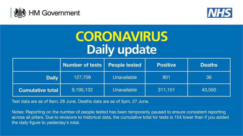
Data from Pillar 2 tests is only just getting through to Directors of Public Health. And the number of people tested is still not disclosed (the number of people tested is still ‘unavailable’).

As of 9am 28 June, there have been 9,195,132 tests, with 127,709 tests on 27 June. 

311,151 people have tested positive. 

As of 5pm on 27 June, of those tested positive for coronavirus, across all settings, 43,550 have sadly died.

Test data are as of 9am, 28 June. Deaths data are as of 5pm, 27 June.

Notes: Reporting on the number of people tested has been temporarily paused to ensure consistent reporting across all pillars. Due to revisions to historical data, the cumulative total for tests is 154 lower than if you added the daily figure to yesterday’s total.

Public Health England only report publicly the level of outbreaks at the Upper Tier Local Authority level (mostly county councils, unless there are large cities such as Leicester where the are unitary authorities).

So, how do we know that there isn’t an outbreak in our local area? Basically, we don’t. But the PHE surveillance report is the best we have for now. Also worth examining the cluster of outbreaks around Manchester (which may be outbreaks in schools or hospitals)

PHE Surveillance Report week 26

What appears to be unusual about the Leicester outbreak is that it does not appear to have been traced back to care homes, hospitals, or schools. It appears to be community transmission, and is the first real test of the Government’s policy of preventing a resurgence of COVID-19

Beware of the Survivorship Bias of Politicians: COVID-19 Letter Published in The Financial Times


The news that UK business secretary Alok Sharma has been tested for Covid-19 highlighted the issue of survivorship bias, that is the systematic overestimation of performance and underestimation of risk by ignoring non-survivors.

In the early stages of the epidemic, the risk perception of politicians broadly matched that of the general population. However, if the proportion of decision makes that have been infected by the virus and survived exceeds that of the population, the executive’s risk appetite could surpass that of the people they represent.

Politicians need to ensure that they make decisions in such a way that suvivorship bias does not affect their judgment.

Dr Duncan Robertson

School of Business and Economics, Loughborough University

Simulation Modelling Community Response to COVID-19

Our paper in Journal of Simulation ‘How simulation modelling can help reduce the impact of COVID-19‘ setting out how simulation modelling can help in the fight against COVID-19 and subsequent epidemics and pandemics. Click here to access the paper.

ABSTRACT

Modelling has been used extensively by all national governments and the World Health Organisation in deciding on the best strategies to pursue in mitigating the effects of COVID-19. Principally these have been epidemiological models aimed at understanding the spread of the disease and the impacts of different interventions. But a global pandemic generates a large number of problems and questions, not just those related to disease transmission, and each requires a different model to find the best solution. In this article we identify challenges resulting from the COVID-19 pandemic and discuss how simulation modelling could help to support decision-makers in making the most informed decisions. Modellers should see the article as a call to arms and decision-makers as a guide to what support is available from the simulation community.

Muddling Through Does Not Work for Pandemics: COVID-19 Letter Published in The Financial Times

In 1959, Charles Lindblom wrote The Science of “Muddling Through”, advocating an incremental approach to public policy and management. “Muddling through” does not work for pandemics. The science of pandemics is dominated by epidemiology, not behavioral science. The delay between policy decisions (or indecisions) and the resultant high UK death rate needs tracing back from the prime minister and his advisers to Cobra, the chief scientific adviser, and the Scientific Advisory Group for Emergencies. However, this is one form of contact tracing that can be delayed until the inevitable public inquiry.

Dr Duncan Robertson
Fellow in Management Studies,
St Catherine’s College,
University of Oxford, UK

Charley Says Social Distancing

Charley was a character in UK Public Information Films in the 1970s. Here he is in ‘Charley Says Social Distancing’


“Treat everyone else as if they’re about to catch fire and you’re a lit match.”


Charley: Miaoweeaawwwoa [I can’t believe I’m writing this]

Narrator: This is you. You’re a match. And these are your friends. You catch the virus and you’re on fire. You’re too close – now all your friends are alight – you’ve infected them with the virus.

Tony, the Boy: Charley says that if ever you see a box of matches lying around, tell mummy because they can hurt you.

Narrator: We’d like the virus to spread slowly so to match the capacity of the health service. It takes a few days before your friends get ill, so you can’t see it spreading.

The virus is spreading rapidly so we need to slow it down. If you’re older or have an underlying medical condition, you need to stay apart.

That’s better. Keep apart. Treat everyone else as if they’re about to catch fire and you’re a lit match.

Charley: Awoooarwah.

SOCIAL DISTANCING. DON’T GET TOO CLOSE

For advice on COVID-19, see:HM Government NHS (UK National Health Service) WHO (World Health Organization) US CDC (Centers for Disease Control and Prevention) US NIH (National Institutes of Health)

YouTube Link: https://www.youtube.com/watch?v=4YmN0iV3f0I

Twitter Link: https://twitter.com/Dr_D_Robertson/status/1241307225626423296