Public Health England have released their data on cases split by age and week. We can turn these into a map visualizing the transmission of the epidemic through ages of cases and through time.
We do this by plotting a three-dimensional chart, a heatmap, where the x axis shows time (split into weeks) and the y axis shows the age of individuals who test positive (split roughly into 10-year groups). The colour of the chart shows the number of cases in each age/week cell.
We work out the cases per 100,000 (a standard epidemiological way of presenting incidence numbers) by finding the population in each age group and dividing the cases by that number (population estimates are from 2018).
The beginning of the epidemic
We can see clearly the very high incidence in the over 80s. We now know that many of these were in care homes (although many were in the community). By 28 June (the last day of this chart), the numbers in each age cohort were relatively low, with an incidence of 18 per 100,000 in the over 80s, but a maximum of 11 cases per 100,000 in the under 80s.
The resurgence
We have produced a new heatmap and scaled the reds to the maximum numbers – so the reds in this heatmap (up to 46 cases per 100,000 in 20 to 29 year-olds) are not as high as the reds in the first heatmap (where we saw a maximum incidence of 232 cases per 100,000 in the over 80s)
What we do see however is a movement from young people (20 to 29-year-olds) to the remainder of the working population (certainly up to 60 year-olds).
Based on data from France, the US, and Spain, that I expect that cases will move to the more vulnerable older population, with the very real risk of hospitalizations and deaths increasing over the weeks ahead. Public Health England has already detected new cases in care homes, and we need to be extremely vigilant and aware to ensure we do not repeat the mistakes of the early part of the epidemic.
Update 18 September
Latest version of my heatmap – shows cases established in the working population and the over-80s.
The case numbers for COVID-19 have risen significantly over the last few days and are now at just under 3,000 cases per day.
We have been told by Minsiters and the Deputy Chief Medical Officer that these cases are primarily in young people. So, why should we be concerned with COVID transmission in young people when they are statistically unlikely to have severe symptoms or be hospitalised or die?
We can look at other countries to see what may happen in the coming weeks.
Various authors have plotted cases vs age vs time. On the x axis is time, on the y axis are ages. Look at weeks S31/S32 (semaine/week 31 and 32). Some incidence in 20-29 year olds. But in week S33, this spreads to 30-70 year olds. And then in week S35 and S36, cases in 70+ year olds.
Here is the UK data for COVID mortality from Public Health England / Joint Biosecurity Centre / NHS Test and Trace. Very few (but some) deaths in young people. So we may not see significant deaths filtering through for a few weeks
Chart 2(b) in the PHE Surveillance report is the one to watch. These data lag by a couple of weeks
but I anticipate cases spreading up through the age pyramid in the next couple of weeks. Which I anticipate will lead to increased hospitalizations in the week after that, and increased deaths a few weeks from that. But this is not inevitable: we need to go back to the fundamental mitigations of social distancing, hand washing, and mask wearing, and not forgetting that the virus is still very much with us.
Update 13 September 2020
Public Health England have released their latest surveillance report and I have made a heatmap for English cases. The data is a week old. We can see high incidence in the 20 to 29 year olds spreading to older ages. I expect this to continue over the coming weeks.
Update 20 September 2020
Here is the heatmap produced for the data published on 18 September. We see an incidence of 20 cases per 100,000 in the over 80s for the most recent week. But look closely at the figure to the left – 21. This is the same as the top right cell in the heatmap above. What is very worrying is that this figure has changed, since PHE publish their data a week in arrears. This imples that indiviuals are having cases included over a week late. This indicates a potential failure in getting these results processed by NHS Test and Trace.
School pupils have had a tough year. For those with examinations, such as A-levels, it has been even tougher. The Department for Education decreed that A-levels and GCSEs should not take place due to the COVID crisis.
This meant that an alternative way of allocating grades to students needed to be found.
To set the context, Ofqual, the Office of Qualifications and Examinations Regulation, regulates qualifications, examinations and assessments in England. It is a Non-Ministerial Government Department constituted under the Apprenticeships, Skills, Children and Learning Act 2009. Now, it is evident that, despite being a non-ministerial department, the Department for Education has a responsibility for setting policy.
Therefore, a Memorandum of Understanding exists between Ofqual and DfE setting out how the two organizations will work together. Section 2 sets out responsibilities:
On 31 March, the Secretary of State, Gavin Williamson, wrote to Ofqual, setting out a ministerial direction. These are the salient points in the Direction:
Firstly, there needs to be a calculation, and secondly ‘as far as possible, the qualification standards are maintained and the distribution of grades follows a similar profile to that in previous years’.
This is a very strong constraint, and to be fair, one that Ofqual met in their initial calculated grade. The problem was it was not fair.
Much debate has been generated as to algorithms, models, and their use in Government (and arm’s length bodies such as Ofqual). But this is not a new problem.
In 2012, the West Coast rail franchise was awarded to FirstGroup. Virgin Trains complained, serious errors were found in the model used by DfT, and the award to FirstGroup was cancelled.
This cost taxpayers £54 million, and, as a result, and report was commissioned to prevent this happening again.
The Aqua Book recommends that there should be a Senior Responsible Owner for each model (for Government departments and their arm’s length bodies, such as Ofqual).
Cumulative COVID-19 deaths per 100,000 population as at 6 July 2020Zoomed in to London
coronavirus-staging.data.gov.uk has just released death totals per local authority. We can divide these by the population to get deaths per 100,000 population up to 5 July 2020. These data and the analysis is provisional and may be updated.
Group 1: Greater than 100 deaths per 100,000 population
Group 2: Between 80 and 100 deaths per 100,000 population
Group 3: Between 60 and 80 deaths per 100,000 populationGroup 4: Between 40 and 60 deaths per 100,000 populationGroup 5: Fewer than 40 deaths per 100,000 population
Public Health England has published an analysis of what is known about the Leiecester outbreak. Diagrams are from the PHE report.
The latest daily case numbers are available at coronavirus.data.gov and are shown below. Note that the latest figures in the data download are not complete, as these will exclude specimens in the post. Also note that the number of positive cases detected will be affected by Leicester being in the news, availability of more testing stations, and the functioning of the NHS Test and Trace service (see update below).
The first thing to note is the mismatch between testing that was disclosed to the public (so called Pillar 1 tests) when a potential lockdown was being discussed by politicians and the total number of tests being conducted (Pillar 1 and Pillar 2 tests). I have discussed why this was a problem here. Since writing, the Government has disclosed total positive tests (but not the number of tests taken) for each location, including Leicester.
Firstly, the number of positive tests rose to 23 June (the chart above updates this slide).
PHE Preliminary Investigation into COVID-19 Exceedances in Leicester (June 2020)
Since then, it appears that the number of positive tests may be falling, but this is preliminary analysis, and we shall know for sure on Thursday when PHE release their updated analysis for the whole country.
The current Leicester cases seem to be through working age people and children (this is where Leicester may be unusual – other outbreaks may be in care homes where the population is older).
PHE Report
This is the spatial analysis of where cases have taken place in Leicester (the left map is Pillar 1 testing and the right map is Pillar 2 testing).
PHE Report
And this breaks down the wards in which most cases were located
PHE Report
with the corresponding map here
PHE Report
It is important to note that testing has been increasing in Leicester, so some of the increase in positive cases may be due to this. William makes the comment below that this may be due to the location of walk-in tests making people from those areas more likely to take tests compared to other areas of the city. There is a feedback effect here, where more positive cases means more testing resources allocated to those areas which means more testing of those areas. Without test data (number of tests in each location), it is not possible to see whether the increased case density is as a result of increased numbers of tests, as we don’t know the percentage of positive cases at each location.
The latest Public Health England national report here with results shown below.
Update: The .gov.uk analysis seems to average out the 7-day average as +/- 3 days which is misleading, as the recent specimen date tests may not have arrived.
The threshold for lockdown is not publicly disclosed (and there is unlikely to be an absolute threshold as local considerations such as where the outbreak is taking place (for example in a factory or a care home that can be relatively well contained). However, Germany has set a threshold of 50 cases per 100,000 to consider an ’emergency brake’ and reimpose lockdown-like restrictions.
Taking the population of Leicester as 348,300, this would mean that this threshold of 50 cases per 100,000 in a week would be 50 * (348,300 / 100,000) / 7 = 25 cases per day as a threshold. Although of course, the threshold for entering and leaving lockdown are not the same. And Directors of Public Health and journalists, armed with timely and complete data, are far more able to understand what is happening at a local level.
I will provide an analysis of the Public Health England data on Thursday when it is published. For updates, please come back to duncanrobertson.com or follow me on Twitter @Dr_D_Robertson
The pubs open on Saturday in England, allowing people to mix in confined spaces and potentially transmit COVID-19.
In Friday’s Number 10 briefing, the Chief Medical Officer said “The biggest risks are when lots of people from completely different households are brought together in close proximity indoors. And whether that’s in a pub or a cricket pavilion that is a high risk activity. And that’s the reason why the really quite onerous social distancing guidelines that are going to cause a significant change to pubs and cause difficulties for many publicans, and we all recognise that, are so essential. There is no doubt these are environments whose principle job it is to bring people together. That’s a great thing to do socially, but it’s also a great thing from the virus’s point of view. And therefore we do have to have a really clear and really disciplined approach to trying to maintain social distancing whilst also enjoying pubs, and this would be true in any other environment”
Which regions of the country are particularly risky? Leicester for a start, where drinking in pubs is banned. Kirklees, Bradford, Blackburn, Rochdale, Rotherham, and Oldham have the next highest cases.
But there are vast swathes of the country that exceed the US Centers for Disease Control threshold for re-opening (10 cases per 100,000 people in a two-week period). While not equivalent, I have used 5 cases per 100,000 people in one week as a cut-off.
I have analyzed the latest Public Health England data to work out which parts of the country exceed these thresholds and plotted them on the map below.
This of course does not mean that other parts of the country are risk-free.
This article was updated on 4 July with the latest data for PHE specimen date for the week to 3 July 2020 inclusive.
Public Health England has today released the second tranche of data for COVID tests. This is the most comprehensive data we have for tests as it includes Pillar 1 tests (those conducted by PHE and NHS hospitals) and Pillar 2 tests (those conducted by private companies under NHS Test and Trace).
Some journalists had been using data from coronavirus.data.gov – but this was dangerously misleading as it only revealed Pillar 1 tests – which are now a relatively small proportion of tests. This had led to erroneous league tables based on Pillar 1 data only until the site was updated late on 2 July.
We want to be able to identify possible regions that have the potential to have remedial action taken, for example local ‘lockdowns’, in the future. This does not mean that these areas will be locked down, more that they should be investigated by Directors of Public Health and local journalists. Without specific local knowledge, here are the criteria I have used to identify regions of interest:
HIGH INCIDENCE REGIONS (RED): Greater than 50 cases per 100,000 individuals. While the Joint Biosecurity Centre has not issued public guidelines for this threshold in the UK, Germany has defined 50 cases per 100,000 inhabitants in a week as the number of cases required for a region to apply an ‘emergency brake’ and reimpose restrictions. Areas meeting these criteria could indicate that there is sustained transmission in this area (but see the caveats below).
WATCHLIST REGIONS (AMBER): Between 40 and 50 cases per 100,000 individuals. (The threshold of 40 is chosen based on a qualitative comparison of Barnsley and Bradford in the PHE Leciester epidemiology report.)
RECOVERING REGIONS (GREEN): In a high incidence or watchlist region last week and fewer than 40 cases per 100,000 this week. It is important to bear in mind that no area is recovered from COVID-19, as outbreaks can recur in any region at any time.
A more general point needs to be made about the paucity of publicly available data. Without timely, complete, accurate data available to the public, there are several issues:
Other towns may see that they have relatively high case levels on the Coronavirus data service, causing unnecessary alarm;
Having data at a coarse geographical area (currently Upper Tier Local Authorities) does not allow outbreaks in towns and villages to be identified;
Unitary authorities (such as Leicester – where the city council performs the role of district and county councils) are separated on the maps, but cities such as Oxford (where there is a city council and a separate county council) are included in the data for Oxfordshire, where urban and rural data is evened out, hiding outbreaks in cities.
There are several caveats that need to be emphasized:
The number of tests carried out: when there are low number of tests, there are necessarily low numbers of detected cases. We do not currently have information for the number of tests carried out in each region, so cannot take account of this – it is possible that high cases per 100,000 is due to particularly high levels of testing in that region.
More local testing in locations with known cases: As local outbreaks are detected, extra testing resources may be allocated to towns such as Leicester, with mobile testing stations being set up. There is a feedback loop here meaning that extra cases will be detected – this does not necessarily mean that there is a higher incidence, just that the cases are being detected.
There is a time lag before this data becomes available: The latest data (published today, 2 July 2020) is for cases detected up to 28 June 2020 – so is not in real-time. In addition, there is a further delay between individuals becoming infected and a case being capable of being detected.
Outbreaks in care homes, hospitals and prisons: These need to be treated independently, and are currently included in the data. We know that there are outbreaks in these locations, and PHE report on these (but we don’t know where these outbreaks are taking place). So Pillar 1 and Pillar 2 data by itself does not indicate that there is community spread – this may be confined to these special locations
Local Directors of Public Health are the experts in their local areas: These professionals are experts, know their communities well, and understand the dynamics of transmission far more than can be ascertained by looking at figures in a database. There have been delays in getting this data to local authorities and issues with data quality, but the Prime Minister has promised in the House of Commons that the data is now getting through.
The delay and lack of detail of Pillar 2 results at district council level, or within-local authority breakdowns (as is disclosed for Pillar 1 tests) highlights data weaknesses, compounding the delays in convening the Joint Biosecurity Centre, and the failure of the centralised NHS Test and Trace App. While directors of public health, Public Health England, NHS Test and Trace, the Joint Biosecurity Centre, and the Department of Health and Social care all play their part, the policy for controlling a pandemic rests with central Government and is ultimately the responsibility of the Prime Minister and the Cabinet. Authority can be delegated but responsibility can not.
In the week 26 Public Health England surveillance report, this map was produced.
PHE Surveillance Report 25 June Figure 9: Weekly rate of COVID-19 cases per 100,000 population tested under Pillar 1 and 2, by upper-tier local authority, England (box shows enlarged maps of London area)
Leicester is subject to a local ‘lockdown’, but what about the other areas highlighted, and how bad are they compared to Leicester?
This is the data behind the map:
PHE Surveillance Report Week 26 Figure 9: Weekly rate of COVID-19 cases per 100,000 population tested under Pillar 1 and 2, by upper-tier local authority, England
This shows that Bradford, Barnsley, and Rochdale are the next four local authorities in terms of the (Pillar 1 and Pillar 2) COVID rate of infection (cases per 100,000 population).
What is not known however, is whether these are locations of community spread (as is reported in Leicester), or are contained outbreaks in schools or other locations which may indicate that community spread is not taking place and hence lockdowns may not be appropriate in these areas.
Following the local ‘lockdown’ in Leicester, lots of people – including newspaper editors – are anxious to answer the question ‘are we next?’.
The lack of reliable Government data poses two problems: firstly, making towns look worse than they are; and secondly making people question why they are in Lockdown.
Data in the UK is disclosed on the Coronavirus data service . Let’s look at what we can see. Here’s Leicester – completely unremarkable. So what’s going on?
The data here is from Public Health England – but crucially this only is the so-called Pillar 1 data – from PHE and the NHS hospital labs. By far the majority of testing is done by Pillar 2 – NHS Test and Trace and the commerial testing operations.
Pillar 1 can pick up spikes in hospitals but crucially it does not pick up community outbreaks. For this we need the Pillar 2 data. And we don’t have it.
The only source is PHE’s surveillance report – the latest being Week 26 (week ending 25 June 2020)
Here we can see Leicester as a red area, denoting more than 45 cases per week. But there are many other areas where there are many cases. Why are they not being locked down? The answer is – we don’t know, because we don’t have the data. And the data has only been released to Directors of Public Health in local councils very recently – and even then only to those that have signed a data protection record. In some ways, having a map with partial data is less use than having no map at all.
Data has been a real issue with the handling of the pandemic, with the Prime Minister launching a new version of the Coronavirus data dashboard last Thursday . But even here, on this brand new dashboard, we see that the Government is showing that there have been no hospital admissions since 16 June. This is plainly wrong, and needs to be fixed immediately. Without the confidence in the data, the public will be hard pressed to see why new lockdown measures need to be introduced, with the reduced compliance with those measures that that will bring
The Home Secretary, when questioned on the BBC Andrew Marr show announced on Sunday 28 June
‘there is going to be a Leicester lockdown?’ ‘So, there will be support going into Leicester … with local flare-ups, it’s right that we have a local solution’
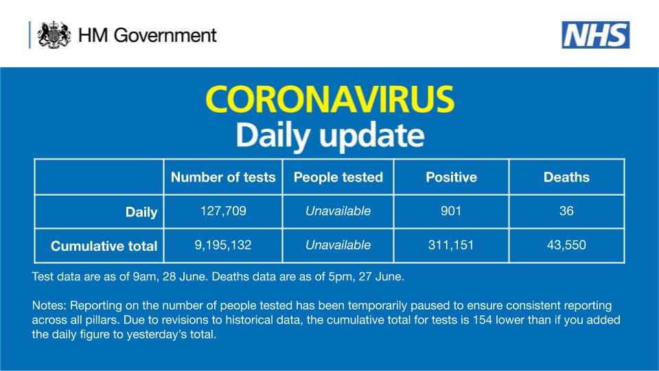
But looking at the public data from coronavirus.data.gov on Covid infections, Leicester does not have a significant problem:
It is only when you look at the Public Health England surveillance report, you notice something awry.
Why the dispartity? This comes from the difference in how tests are reported. Coronavirus.data.gov only reveals so-called ‘Pillar 1’ tests (those in the NHS), wheres the PHE maps include both Pillar 1 and Pillar 2, the latter being conducted under the auspices of NHS Test and Trace and other commercial partners.
Data from Pillar 2 tests is only just getting through to Directors of Public Health. And the number of people tested is still not disclosed (the number of people tested is still ‘unavailable’).
Public Health England only report publicly the level of outbreaks at the Upper Tier Local Authority level (mostly county councils, unless there are large cities such as Leicester where the are unitary authorities).
So, how do we know that there isn’t an outbreak in our local area? Basically, we don’t. But the PHE surveillance report is the best we have for now. Also worth examining the cluster of outbreaks around Manchester (which may be outbreaks in schools or hospitals)
PHE Surveillance Report week 26
What appears to be unusual about the Leicester outbreak is that it does not appear to have been traced back to care homes, hospitals, or schools. It appears to be community transmission, and is the first real test of the Government’s policy of preventing a resurgence of COVID-19